

If you’ve ever set up a SharePoint home page, you know the drill – people need to get to the important stuff fast. The out-of-the-box Quick Links web part is fine, but I wanted something with more control over branding, colors, and behavior. So I built my own: SharePoint Quick Link, an open-source SPFx web part that displays customizable quick-link cards pointing to your most important pages and sections.
In this post, I’ll walk you through what it does, how it’s built, and how you can deploy it to your own tenant. The full source code is available on GitHub.
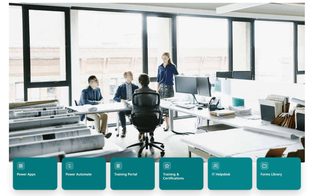
Why Build a Custom Quick Links Web Part?
Don’t get me wrong – the built-in Quick Links web part covers a lot of scenarios. But when you’re building an intranet landing page or a blog hub, you quickly run into its limits. Maybe you want each card to match your brand colors exactly. Maybe you want per-card control over icon colors, tooltips, and whether a link opens in a new tab. Or maybe you just want a consistent, opinionated layout of 3 to 6 cards that always looks tidy.
That’s exactly the itch this project scratches. I originally created it for my own site, but it’s generic enough to drop into any modern SharePoint page.
What This Web Part Does
Here’s the short version of what SharePoint Quick Link gives you:
- 3 to 6 quick-link cards displayed in a clean, card-based layout
- Per-card customization: each card has its own title, URL, tooltip, icon, and optional colors
- Open in new tab support, configurable per card
- Section-level branding: a
sectionTitleandbrandColorproperty let you tie the whole web part into your site’s visual identity
Everything is configured through the standard SPFx property pane – no code changes needed once it’s deployed. Site owners edit the page, click the pencil icon on the web part, and adjust cards, colors, and URLs right there.
Under the Hood: The Tech Stack
- SharePoint Framework (SPFx) 1.20.0 – the modern, supported way to build SharePoint customizations
- React 17 – for the card UI
- TypeScript 4.7 – type safety across the web part and property pane interfaces
- Gulp – the standard SPFx build pipeline
- SCSS – for styling the cards
Configuring Your Cards
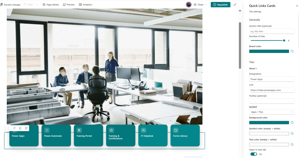
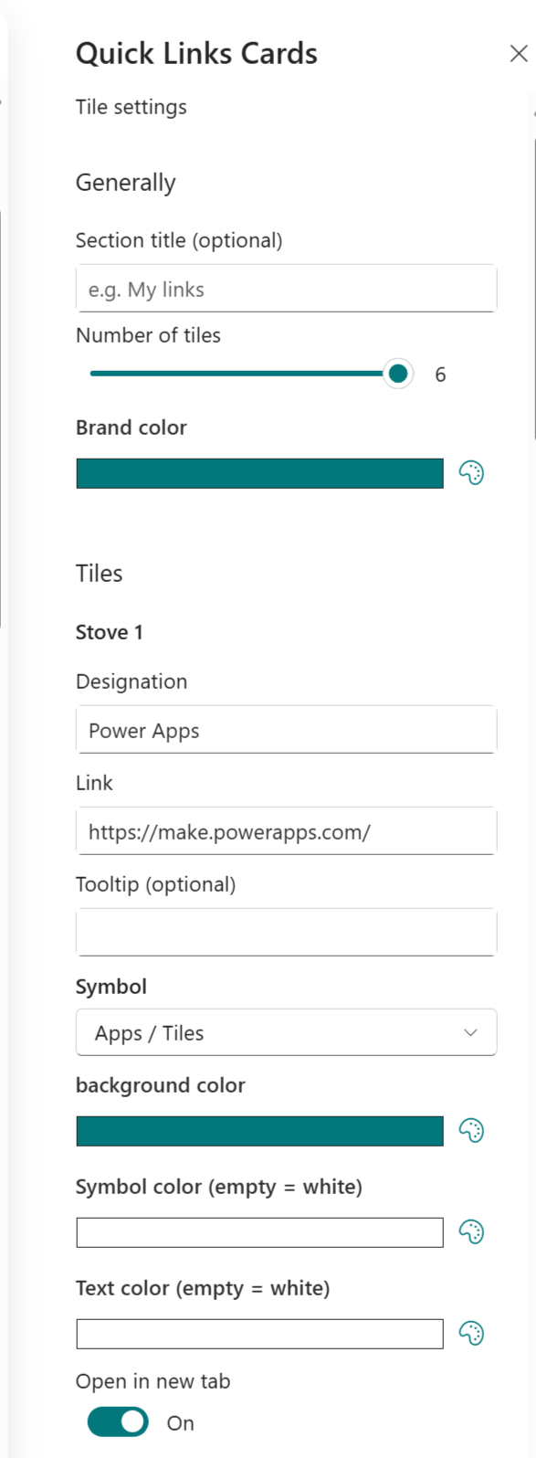
This is where the web part earns its keep. Each card supports the following properties:
title– the text displayed on the cardurl– where the card pointstooltip– optional hover text for extra contexticonName– the icon shown on the cardbgColor– optional background color (HEX)iconColor– optional icon color (HEX)titleColor– optional title text color (HEX)openInNewTab– true/false, per card
Colors are entered as standard HEX values, for example #2b5ce6. Combined with the web-part-level sectionTitle and brandColor, you can make the whole block feel native to your site’s design system rather than like a bolted-on widget.
What’s Next
The project is open source, and I’d love for people to use it, break it, and improve it. If you have ideas – more layout options, dynamic data sources, audience targeting – open an issue or a pull request on GitHub.
If you build something with it, let me know. Happy customizing!


Leave a comment